There’s nothing better than logging into your social media platform of choice and…SURPRISE! It looks completely different.If you’ve visited your Facebook Fan Page over the last month, specifically on a desktop computer or laptop, you probably received that bit of shock, too. Wait, is that my Page? Yup, everything is still there, just in different locations, and with a few bonus features. Before you start pulling your hair out, save that for another more worthy surprise and check out some of the main things you need to know about the Facebook Fan Page layout changes.
1. Visit your Facebook Fan Page. Even if everything looks the same on your phone or tablet, the desktop layout is different and you’ll want to review what your fans see from that perspective. For example, there’s now left-hand side navigation. The profile photo and cover image are no longer on top of each other. Bottom line: Lots of shifting around.
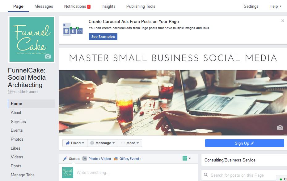
2. Check out that left sidebar. It’s a good time to revisit what’s populated in those sections, particularly in the “About” section. Is it still accurate? Is the information complete?
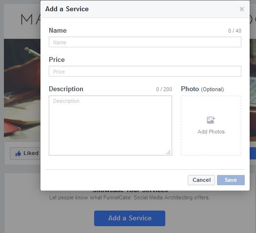
3. Speaking of complete, how about the new “Services” section? Click on the “Services” link on the left-hand side and you’re taken to the option below. This is obviously a great feature for businesses that offer traditional services, such as a financial advisor who could list out areas he focuses in. For example, those could include things like tax services, retirement planning, financial plans, etc. The cool thing is that other types of businesses also win with the addition of this section. Maybe you’re a restaurant and people typically just associate you with standard dining. However, this section gives you the opportunity to call out that you also offer venue rental for special occasions, offsite catering and more.

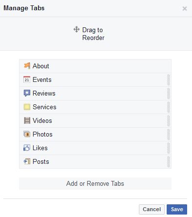
4. Choose what your fans see first! Is the left-hand sidebar not in the order you’d prefer? For example, maybe you’re constantly adding events, but don’t have as much video. Solution: Move it around using the “Manage Tabs” option at the bottom of the sidebar!
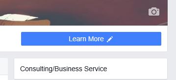
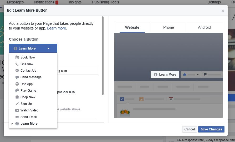
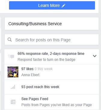
5. Button it up! Whether you ignored the button option previously, or you can feature something new with the additional options, take a minute to give this button some attention. Go to the right-hand side of your business’ Facebook Fan Page and you’ll see a blue button. It might look different, depending on how you’ve customized it (or not) in the past. For example, ours is currently “Learn More.” If you hover over that button, a variety of options drop down for you, including test, promote, edit, view insights and delete. If you select “Edit,” there are now enhanced options. (Hooray!) Select what’s best for your business’ needs, complete the URL and select “Save Changes.”
6. Where’d the newsfeed go?! In the past, you used to be able to select to use Facebook as your Fan Page. That feature seems to be gone now, so you can visit your Fan Page’s newsfeed in the traditional way that you do on your personal Facebook account. Now. head back over to the right-hand side below our new friend, the blue button, and scroll down just a bit until you see “See Pages Feed.” Click that will take you the new version of your Facebook newsfeed where you can like, comment and interact with other Facebook Fan Pages that your business follows.
Whew! Now you can feel at home again on your Facebook Fan Page. There are definitely other functionalities and changes from the layout update, so after you work these favorites, take a few minutes to explore more.
Happy updating!
Anna
P.S. Looking for more tutorials? Check out more ways to keep up with what’s new in social media, from walk-throughs online at your pace, to our Facebook community and more!



This was extremely helpful for me! Thank you!
Glad it was helpful! Changes can be frustrating, but most of these seem to be positive so far. Let us know if you catch any others you think should be added. Cheers!